Skip to content

Reduce, Reuse, and Recycle
When you’ve been regularly writing online articles for 13 years, with an average of six articles per year, eventually you find that you occasionally come up with a great idea for an article, but later you realize that you’ve already written an article on that topic. That’s happened to me a few times, most recently with an idea to write an article about getting up to speed on the subject matter involved in a project. I realized that I wrote an article almost ten years ago. October 6, 2011, I published an article “Learning the Subject Matter” on Johnny Holland, a UX magazine that stopped publishing new articles a few years later.

I thought about writing an updated version with what I’ve learned in the last ten years, but it didn’t make sense with that original article still being online. However, I recently took a look at that article, and found to my distress that JohnnyHolland.com is no longer online. Sometime within the last year it went offline.

It seemed to be a sign that it was time to finally write that update. Luckily I was able to find my Johnny Holland articles on the Internet Wayback Machine, and I downloaded the text. My original Word documents of those articles had disappeared from a few computers ago. So I recycled the original article and wrote an updated version, revising the original article significantly and adding and removing pieces based on my experiences from the last ten years.

On June 21, 2021, almost 10 years later, I published the updated version on UXmatters, Learning Complex Subject Matter.

Image reduce-reuse-recycle-repeat by Phil Gibbs is licensed under CC BY 2.0
Tips for Delivering Bad News to Clients

Ugly software interface

Your Baby is Ugly!

That’s the title of the article I just published on UXmatters,  in which I give advice on how to soften the blow of delivering bad news to clients. Let’s face it, when we perform an expert evaluation, usability testing, or user research on an existing product – most of what we find is problems with the current product. Clients don’t pay us to tell them how great their products are. If they’ve hired us, it’s to find problems that can be fixed. But there are ways to make it easier to deliver bad news. In this article I provide the following advice:

  • Get the stakeholders to admit that it’s ugly first
  • Get everyone to buy into your research methods upfront
  • Encourage stakeholders to observe the research
  • Blame the bad news on the participants
  • Back up your findings with metrics
  • Present recordings and quotations
  • Don’t beat your audience over the head
  • Emphasize your expertise
  • Back up your findings with examples of best practices
  • Show your stakeholders they’re not alone
  • Position it as providing recommendations, not pointing out problems
  • Mention the positive aspects too
  • Deliver your findings in person
  • Prioritize the problems they should solve
  • Provide a plan for addressing the problems

You can find more details about this advice in my latest article, Your Baby is Ugly.

Difficult Usability Testing Participants

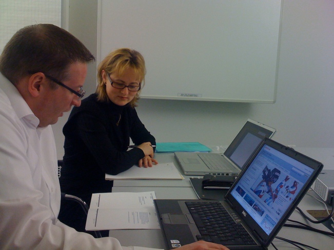
Usability testing session

A key skill you need for usability testing is the ability to work well with a variety of different types of people. You meet all kinds of people as usability testing participants. Over time, you get used to adjusting your approach to different personalities and characteristics. Most people are easy to deal with. However, some people present challenges.

In my latest UXmatters article, “Wrangling Difficult Usability Testing Participants,” I discuss ten types of challenging participants and how to best adjust your interaction with them to get the best testing experience.

Remember Clippy?

Clippy, the Microsoft Office assistant

In my latest article on UXmatters, Five Degrees of User Assistance, I bring up a character that people love to hate – Clippy, of course! Although I do have sort of a soft spot for the little guy, he is a great example of unwanted user assistance.

Poor Clippy! It really wasn’t his fault, he came along at a time when computers were too stupid to accurately predict when people needed help. Programmed to jump out when certain events occurred, to enthusiastically offer his assistance, instead he came across as an unwanted interruption and annoyance.

Today, as technology becomes increasingly intelligent, computers are smart enough to provide more appropriate and more accurate user assistance. In my latest article I describe these five levels of user assistance:

  • Passively providing online Help content. Here’s help if you need it.
  • Asking if the user needs help. Can I help you?
  • Proactively offering suggestions that users can accept or ignore. Is this what you want, or do you want to correct this?
  • Alerting the user that it’s going to take an action automatically, unless the user says not to. I’m going to do this, unless you tell me not to.
  • Automatically taking an action for the user, without asking for permission. I’ve got this for you. Don’t worry about it.


Check it out at UXmatters: Five Degrees of User Assistance

Image source: Clippy, created by J. Albert Bowden II and licensed under CC BY 2.0

Paper Prototyping: Is it still worth it?

In my latest UXmatters article, I compare the latest prototyping tools to paper prototyping. Paper has long had the advantage in allowing designers to quickly and easily create early prototypes, that look unfinished, and encourage users to honestly provide criticism. However, the latest prototyping tools have caught up to, and in some cases surpassed, paper in making it very easy and quick to create prototypes without any coding.

So, do the advantages of paper prototypes still beat these new prototyping tools? That’s what I explore in my latest article, Prototyping: Paper Versus Digital.

Image credit: Samuel Mann

Tips on Comparative Usability Testing

Usability Testing Session

I just published an article in UXmatters, Conducting Qualitative, Comparative Usability Testing. It’s about conducting usability testing with two or more designs, early in the design process to get better information and better user feedback, before settling too soon on one particular design.

When participants are able to experience multiple designs, they can provide better feedback. As a result, you can gain greater insight into the elements of each design that work well and those that cause problems.

Testing Your Own Designs

Usability testing session

Today I published an article in UXmatters, Testing Your Own Designs. It’s often been said that you shouldn’t conduct usability testing on your own designs, because you may be too biased, defensive, or too close to the design to be an impartial facilitator. Although that may be the ideal, often UX designers don’t have a choice. They may be the only person available to test the design, so if they don’t test it, no one will. So in this article I provide advice for those times when you have to test your own design, and I also provide advice for when someone else tests your design.

I was hesitant to write this article, because it’s been a topic that many others have written about, but I felt that as someone who has been on all sides of the issue, I had something additional to add. Here are some other good articles about this topic:

Testing Your Own Designs: Bad Idea? and Testing Your Own Designs Redux by Paul Sherman

Should Designers and Developers Do Usability? by Jakob Nielsen

BECAUSE NOBODY’S BABY IS UGLY … SHOULD DESIGNERS TEST THEIR OWN STUFF? by Cathy Carr at Bunnyfoot

It’s Only Usability Testing, What Could Go Wrong?

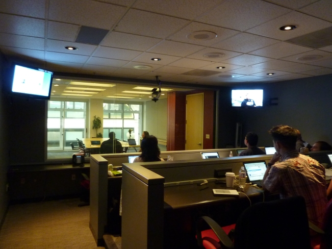
Usability Testing Observation Room

I published a new article in UXmatters this week, “What Could Possibly Go Wrong? The Biggest Mistakes in Usability Testing.”

This article came out of thinking about all of the mistakes I’ve made, and problems I’ve encountered, over the last 16 years conducting usability testing. I think it’s good to look back and think about the lessons you’ve learned. This article is jam-packed with advice learned the hard way.

Usability testing is the most highly structured user research method. Compared to field studies and interviews, the tasks and questions are usually highly planned, and you usually stick pretty close to the discussion guide. That also makes it the most repetitive method. You see the same types of people performing the same tasks and answering the same questions over and over again.

After you get some experience, you can begin to think of usability testing as routine and pretty easy. At a former company, it was the first task that we gave to new researchers, just out of college. It seemed like the easiest method to learn. That may be true, but there are still all kinds of mistakes that can occur. This article discusses the main problems and how to avoid them.

Photo by Blue Oxen Associates on Flickr

This One Goes to 11

I just published an article on UXmatters, 10 User Research Myths and Misconceptions. It addresses common misunderstandings about user research that I’ve encountered over the years.

Here’s a bonus outtake from the article, Myth 11…

Myth 11: Field Research Is Better Than Usability Testing

On the other end of the spectrum from those who don’t understand the difference between user research and usability testing, are the user research elitists who think up-front, generative user research methods are far superior to usability testing. In this view, field studies take researchers out of the lab to observe people in their natural environments performing their usual activities, while usability testing takes place in the sterile, artificial environment of a usability lab and asks people to perform a limited set of artificial tasks. Instead of learning about people and what they really do, usability testing provides the limited value of learning whether people can perform your artificial tasks.

The Truth: Both Field Research and Usability Testing Have Their Places

Field studies and usability testing are two different methods used for different, but equally important, purposes. Field studies provide information to inform design, while usability testing evaluates a design. You have to make interpretations and conclusions from the user research and apply that to a design. Even after very thorough user research, you’re never completely sure that what you’ve designed will work well for the users. Usability testing is the evaluation that either confirms your decisions or points you to refinements. Both user research and usability testing are important and necessary. There’s no reason we can’t appreciate the value of both methods.

Analysis Is Cool

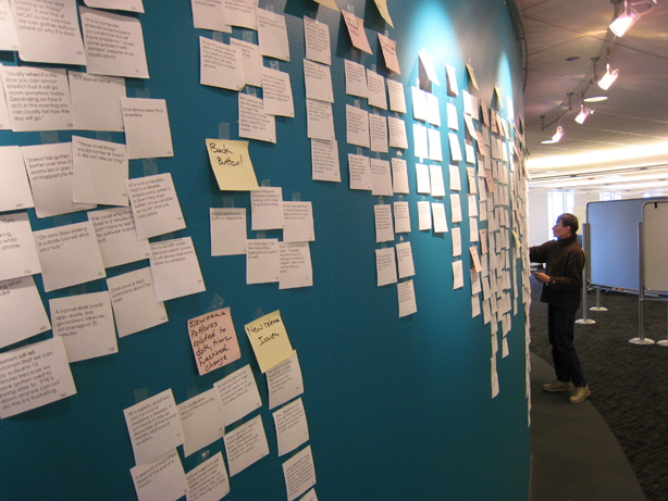
Affinity diagram

Analyzing the data is the most interesting part of user research. That’s where you see the trends, spot insights, and make conclusions. It’s where all the work comes together and you get the answers to your questions.

Why, then, did I publish an article in UXmatters – Analysis Isn’t Cool? All too often I’ve realized that clients, management, and project stakeholders underestimate the analysis phase and just want to get to the answers. People like to say that they did user research, but they don’t like to spend the time to analyze the data. They like the deliverables, whether they read them or not, but they don’t want to spend a lot of time on the analysis to produce those deliverables.

In this article, I discuss what analysis involves, methods for individual and group analysis, and ways to speed up the analysis process.


Photo by Josh Evnin on Flickr